Pei Chicken
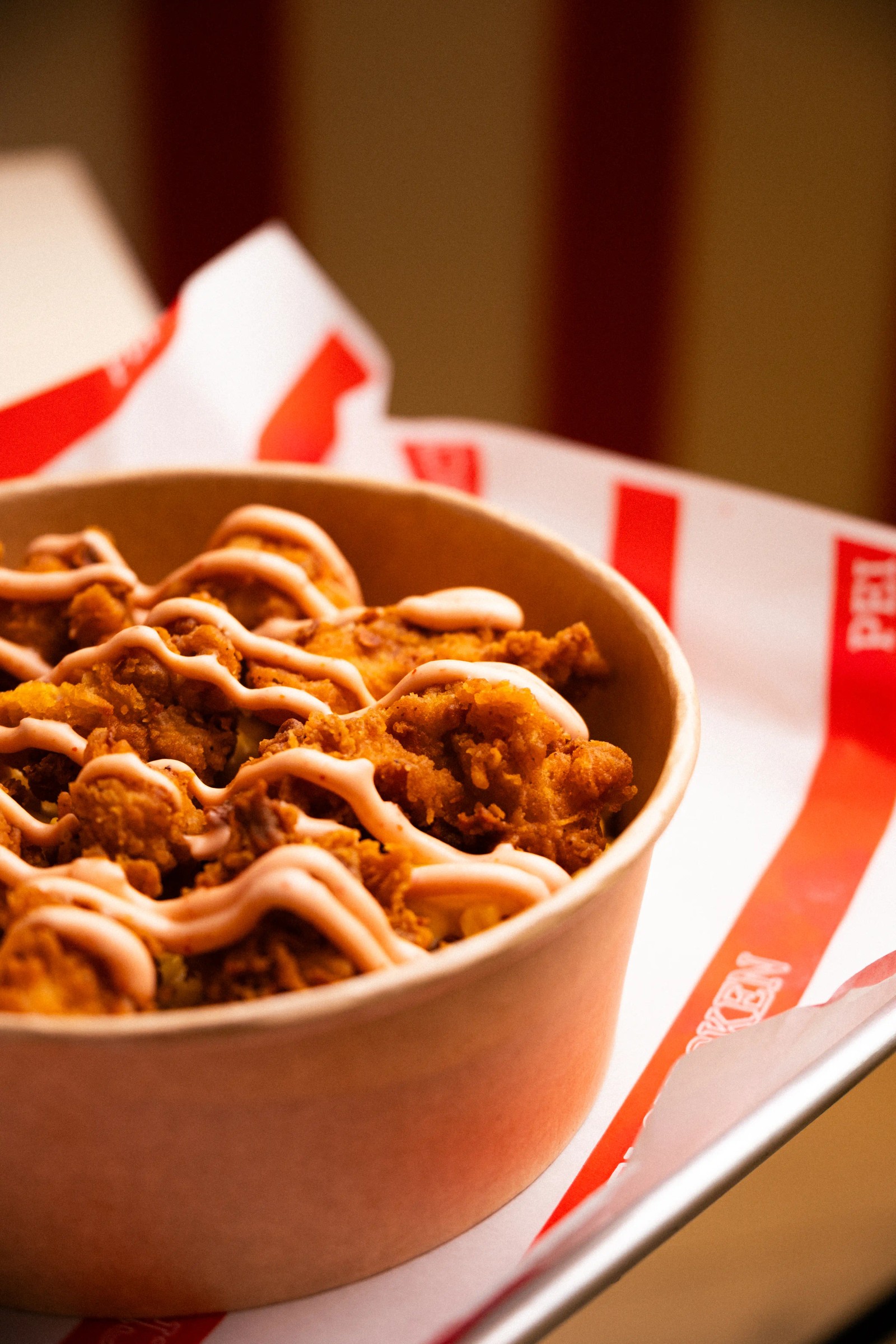
Food production and social media for a fried chicken brand, built on red and white stripes, retro type and food shot close enough to hear the crunch.

Pei Chicken serves fried chicken, wings, burgers and loaded fries out of a fast counter. The category is crowded and every brand in it looks the same after dark. Our job was to make Pei read instantly, from the stripe on the basket to the sauce on the fries.
Art Direction
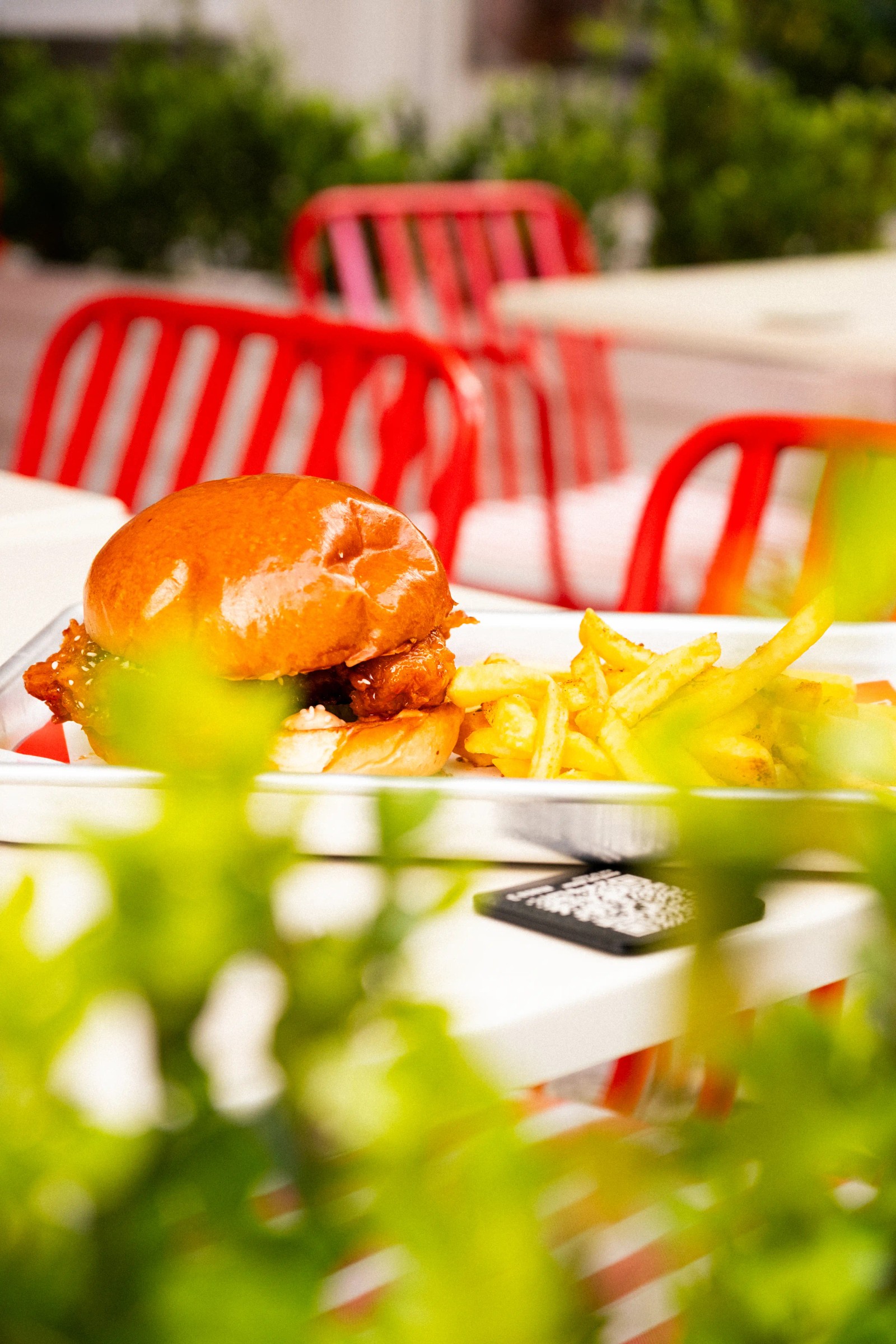
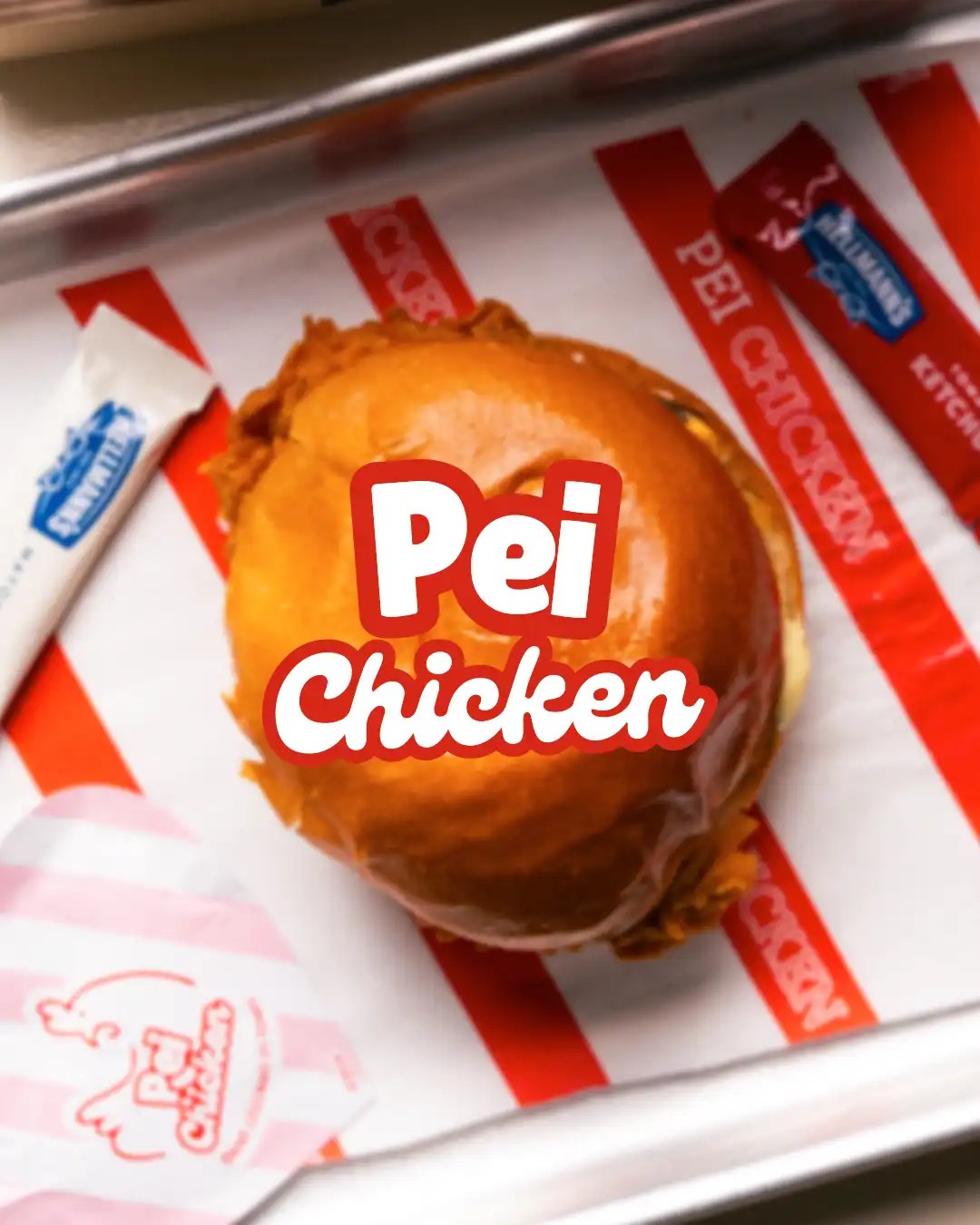
Red and white run through everything, the tray liner, the basket, the wrapper, the campaign frame. A striped ground makes the food pop without any set dressing, so we let the packaging carry the colour instead of building backdrops.
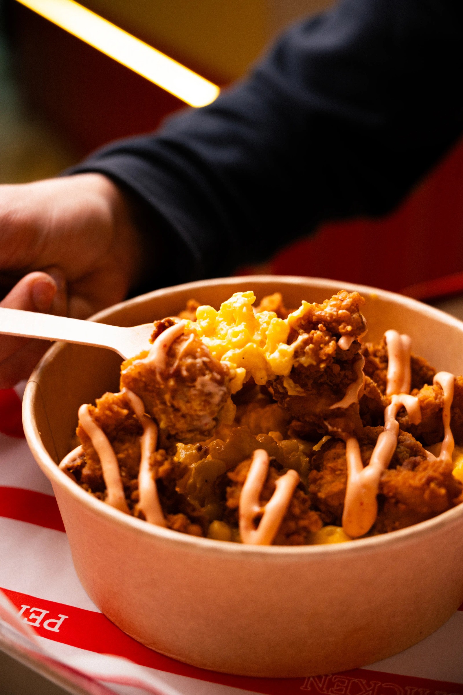
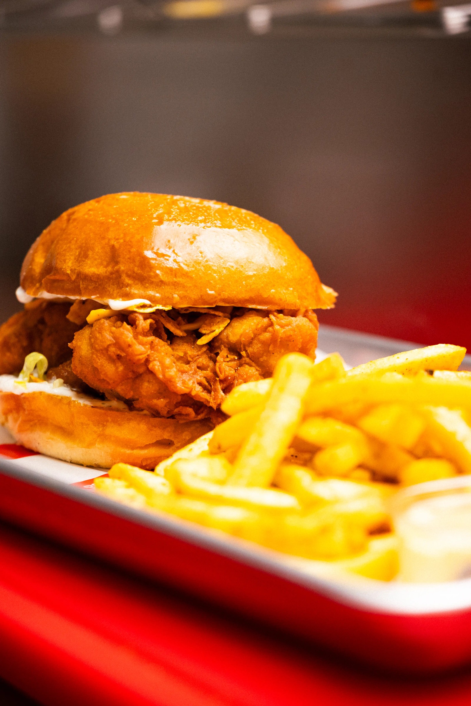
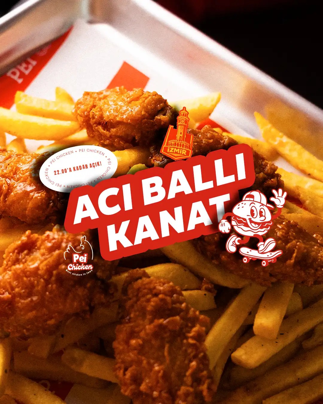
We shot the food in service, held, lifted, poured over. A hand pulling chicken out of frame, sauce dropping across the fries, wings landing in the basket. Fried food only reads hot while it is moving, so we shot the moment before it settles.
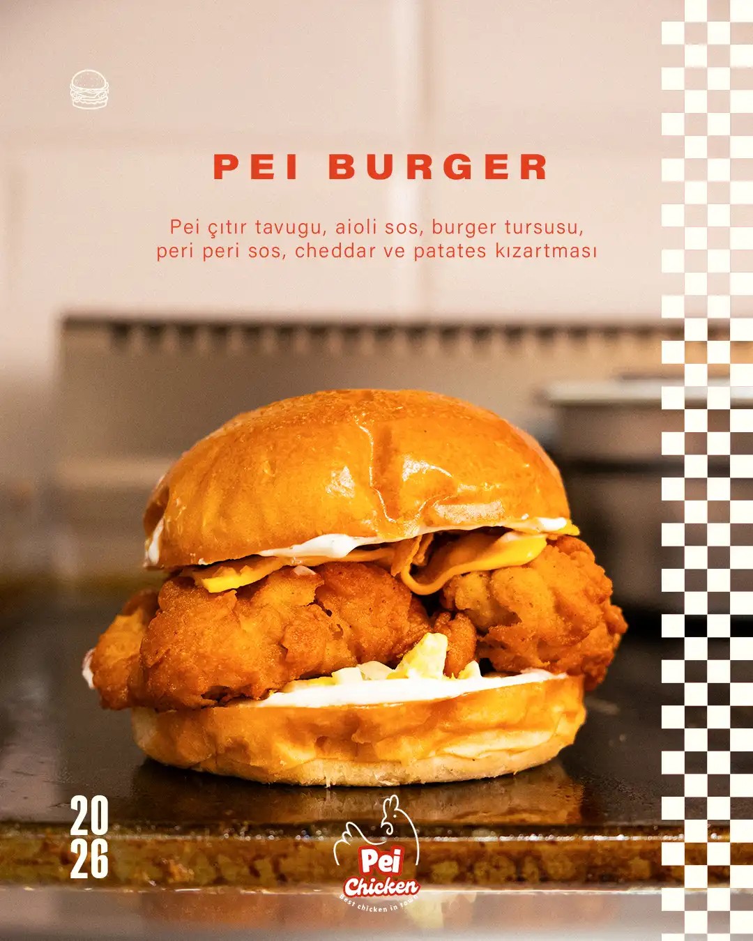
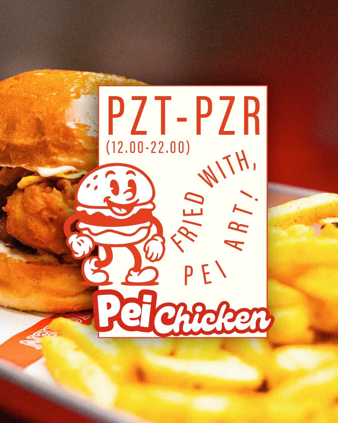
Campaign frames carry the retro mascot and heavy stencil type over the food, "Acı Ballı Kanat", "Fried with Pei Art". Keeping one type voice and one palette means every post is recognisable as Pei before anyone reads a word.
Creative Process
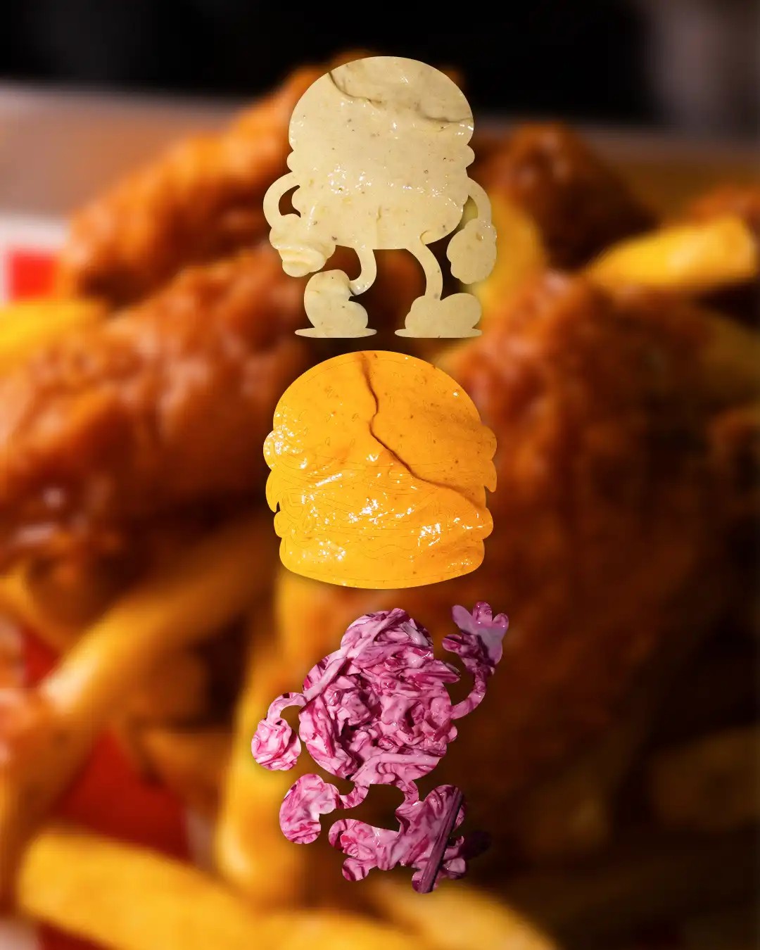
We picked the items that had to sell, the burger, the wings, the loaded fries, and mapped each one to a treatment before shooting. Assigning the frame in advance meant the campaign posts and the menu shots came out of a single system rather than two sessions.
From there the account runs on a steady cycle of stills, reels and campaign frames. New items and limited runs drop straight into the same stripe and type rules, so the feed keeps moving without the look drifting.