Take Eat
Food production and social media for a street food chicken brand, built to make the packaging, the crunch and the colour work as one loud signal.

Take Eat sells fried chicken, burgers and fries over a counter, fast. Street food lives or dies on how it looks in the two seconds before someone decides. Our job was to give the brand a frame loud enough to stop the scroll and consistent enough to be recognised without the logo.
Art Direction
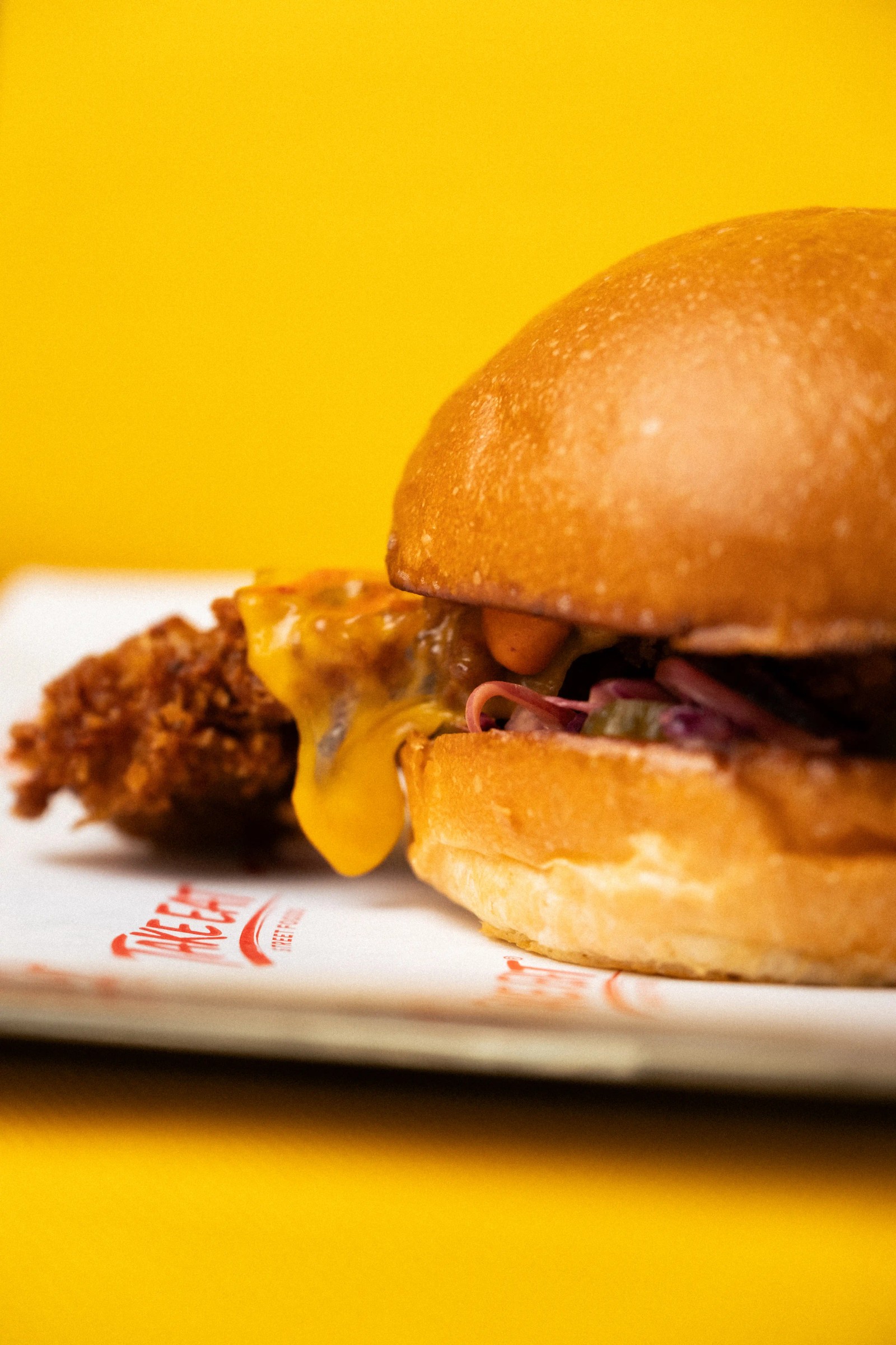
We shot on flat, saturated yellow with the red mark cutting across it. Street food should look as bright as the sign above the counter, so we matched the set to the storefront instead of softening it for the camera.
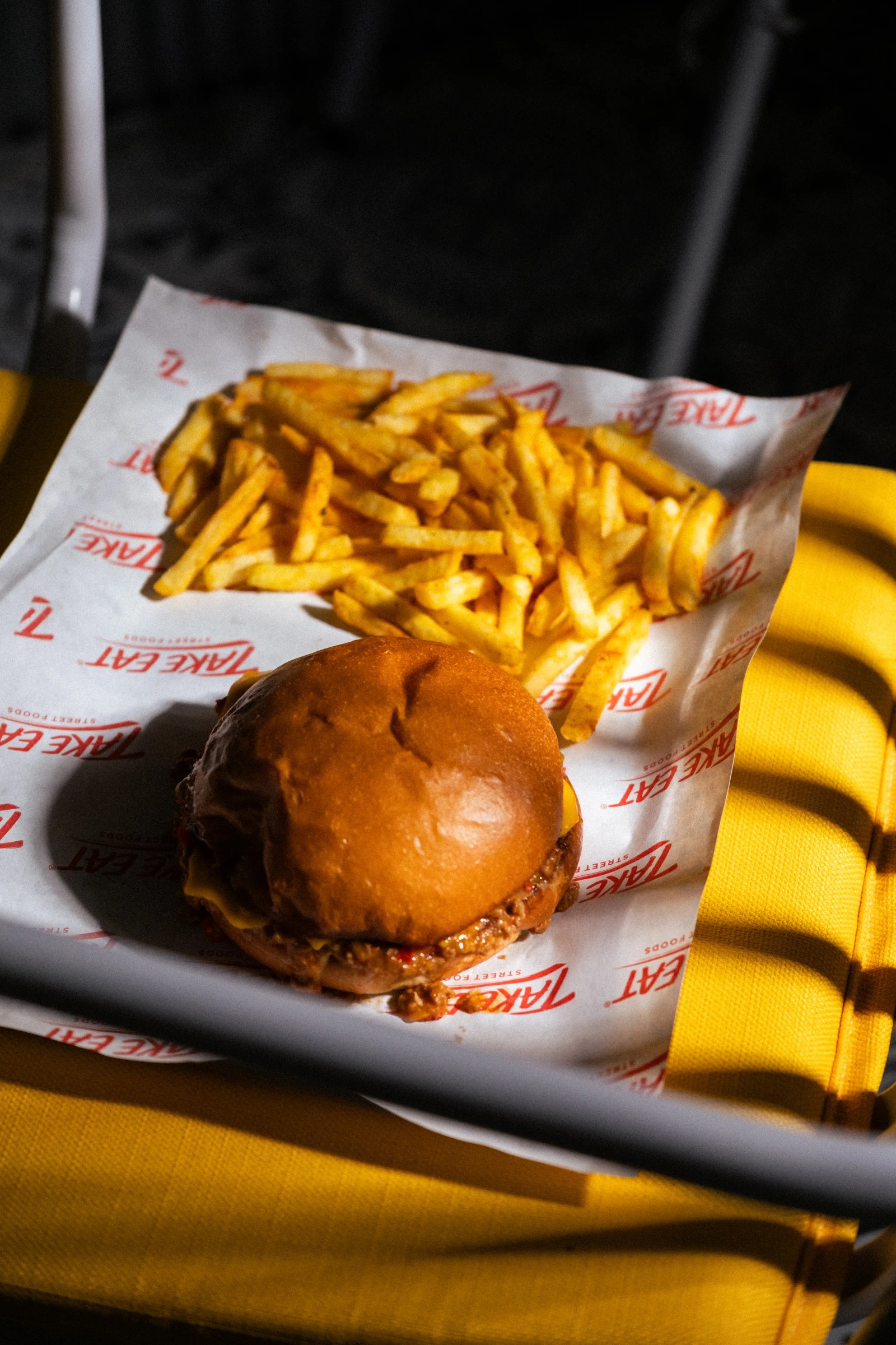
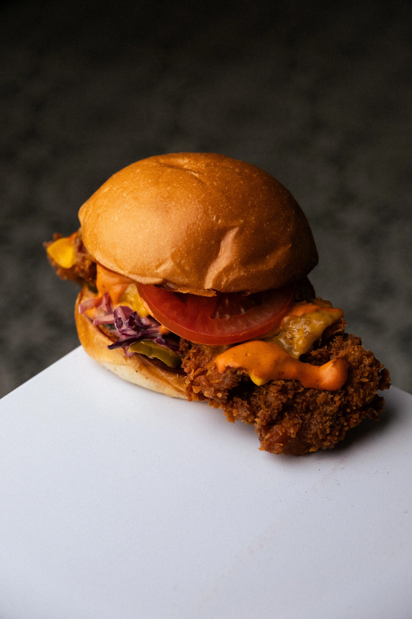
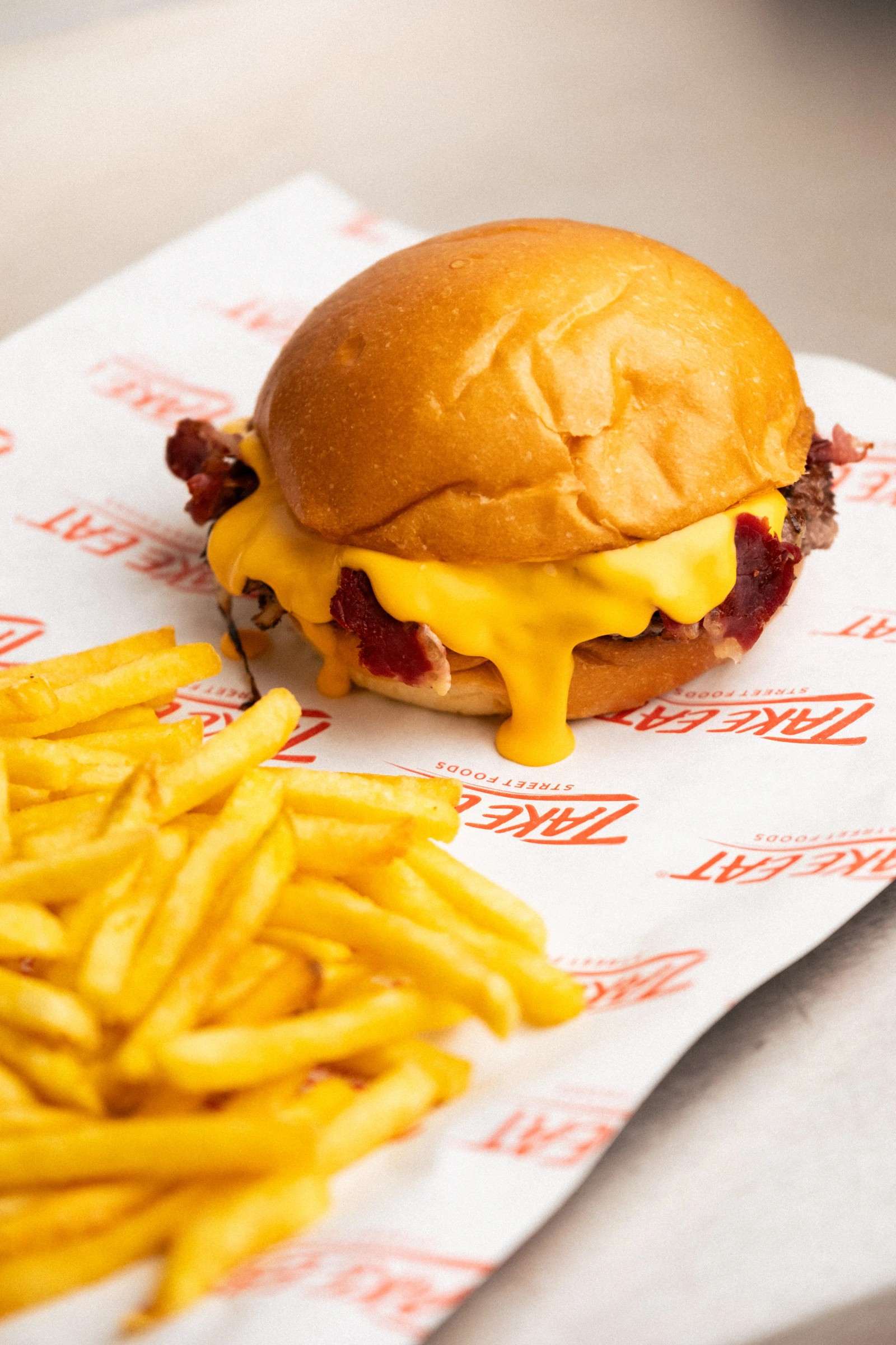
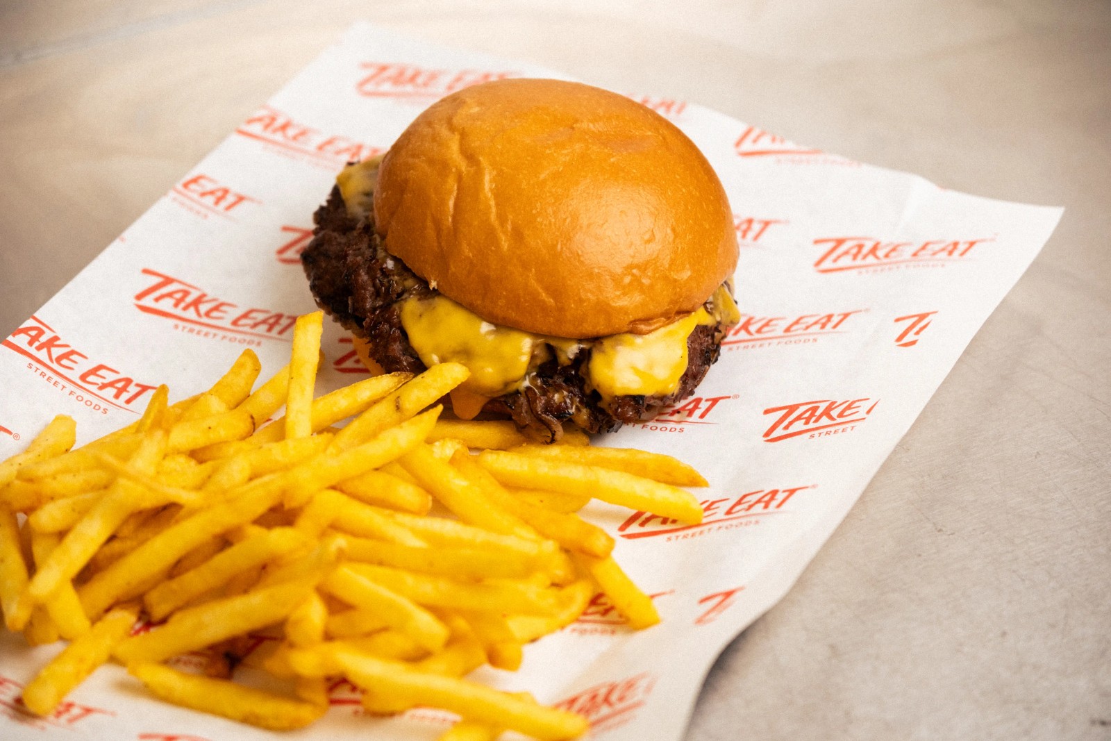
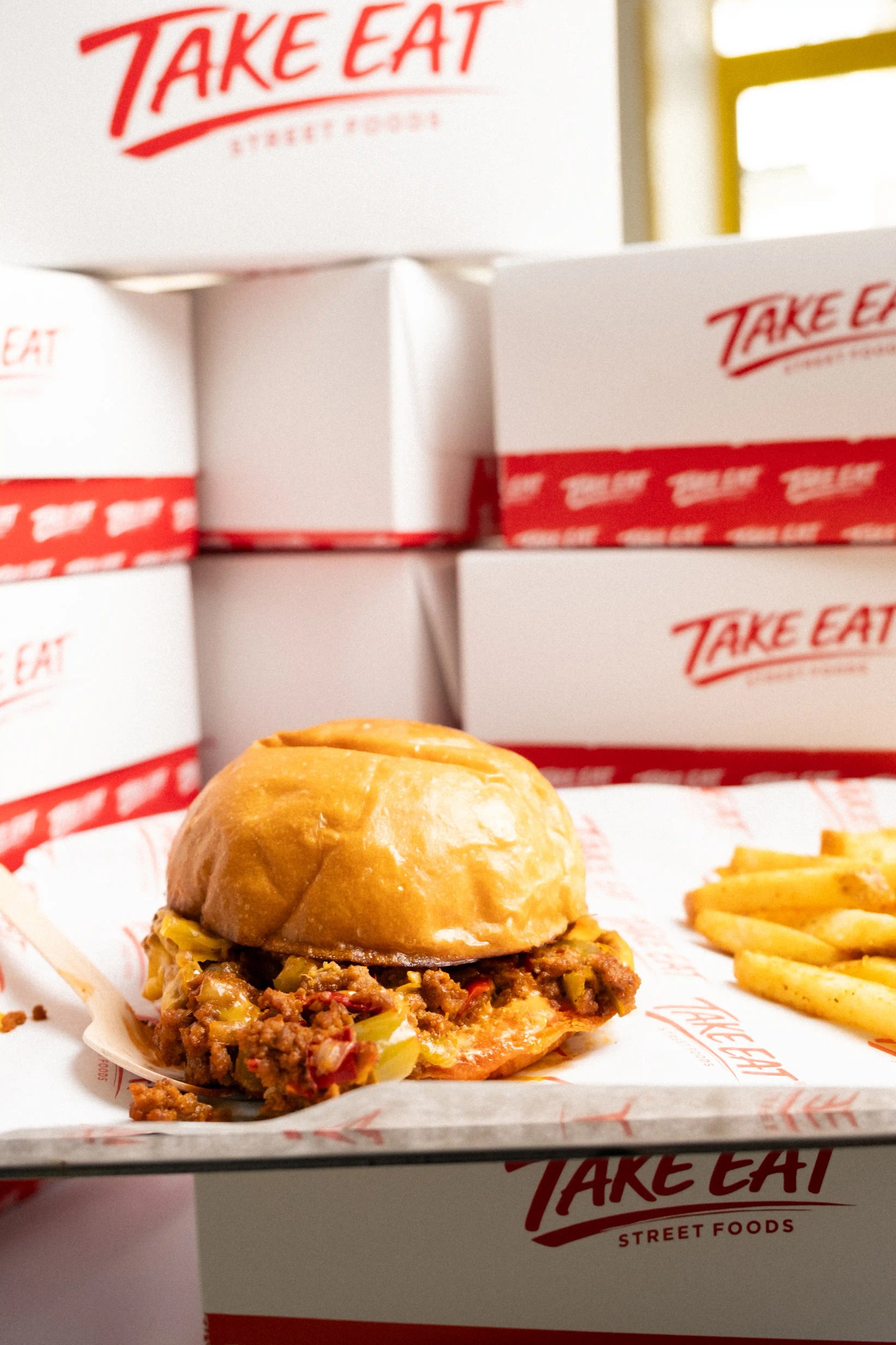
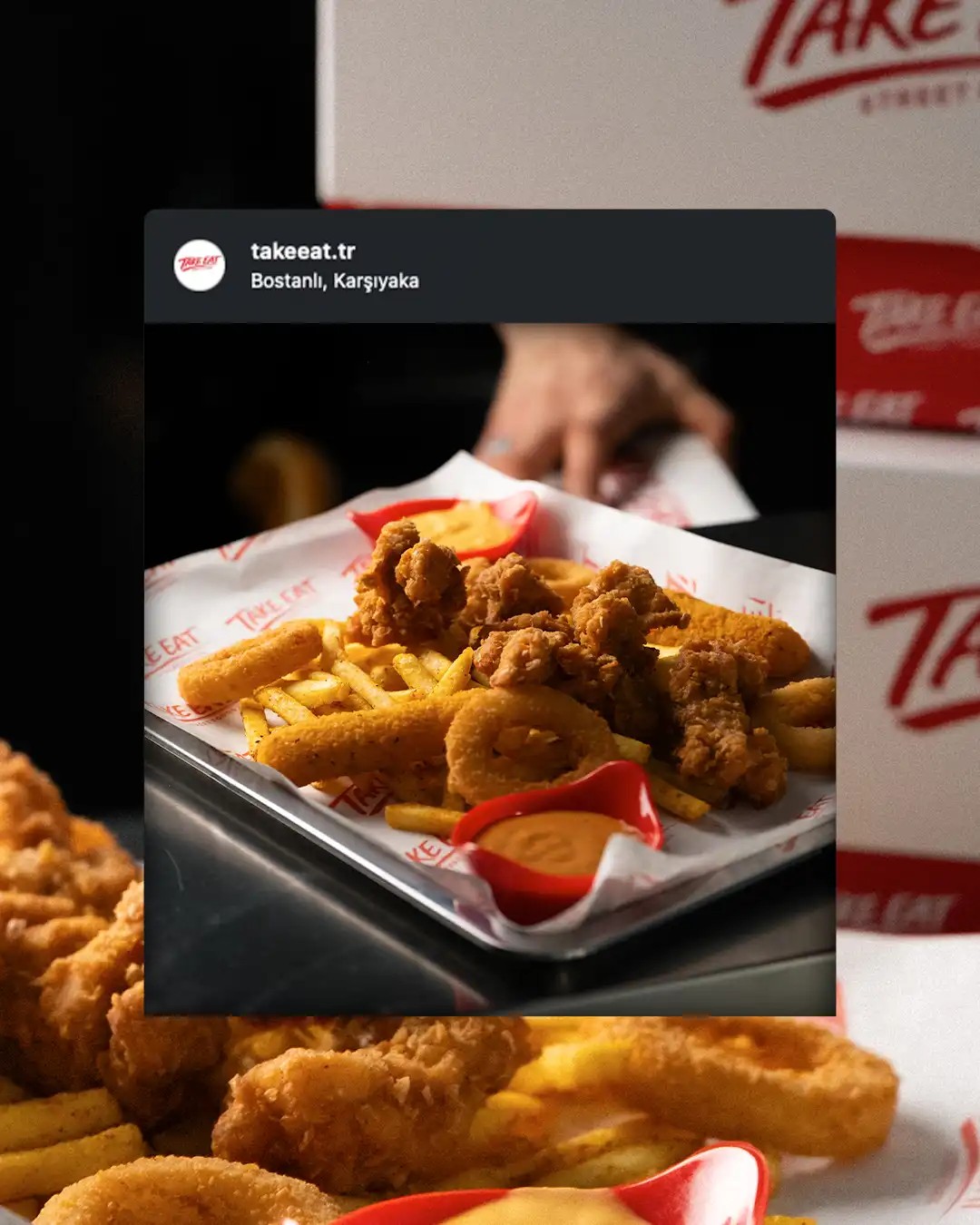
We shot the food the way it is actually served, on the branded wrapper, in the printed box, fries spilling out. Packaging is the only thing a customer holds, so we made it part of the product shot rather than cropping it away.
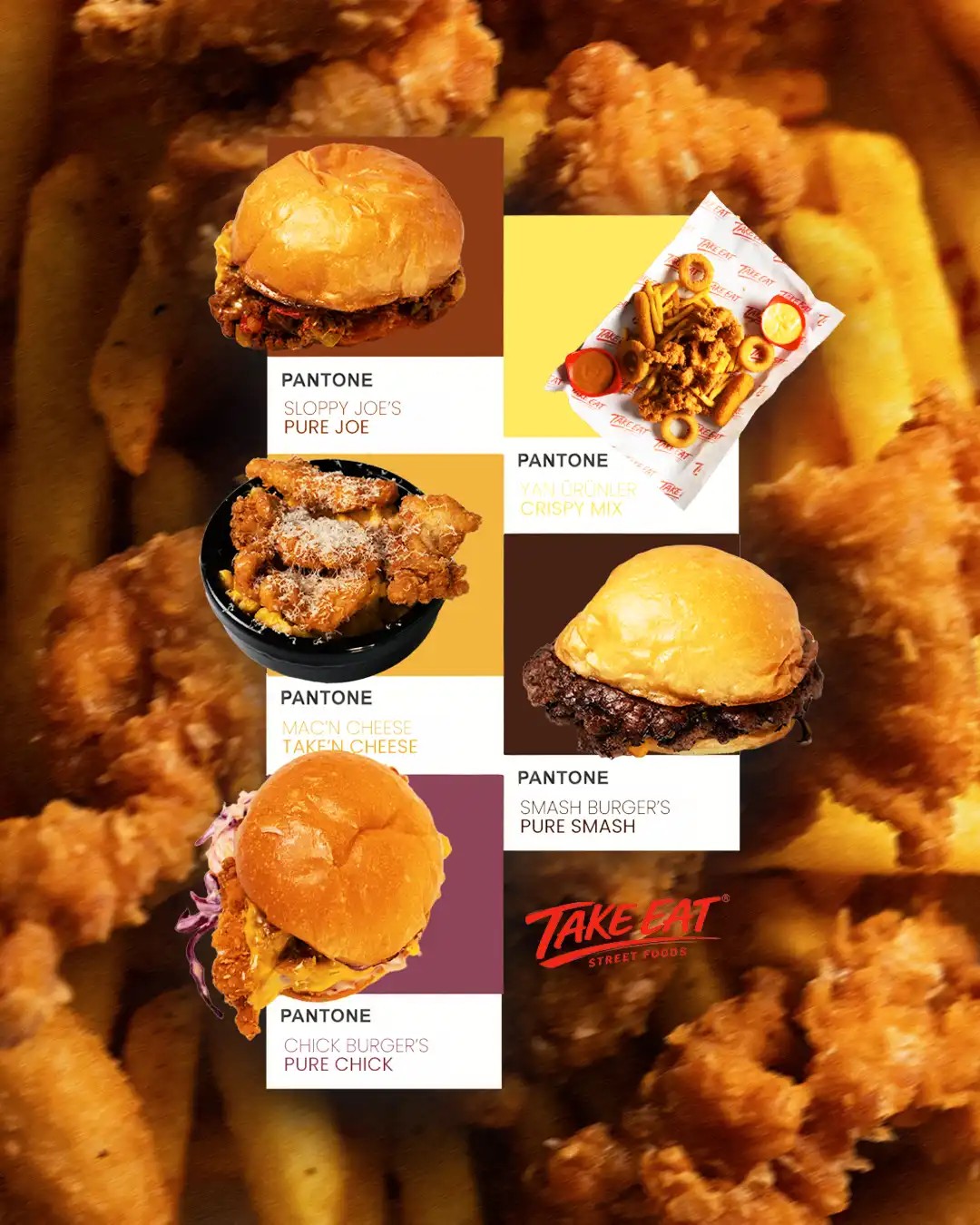
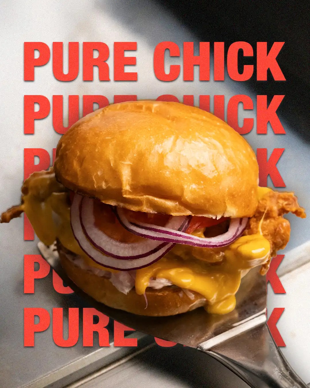
Campaign frames carry heavy display type over the food, "Pure Chick" repeating across the ground, and the colour system is pinned to fixed swatches so red and yellow land the same every time. Locking the palette means every post reads as Take Eat at thumbnail size.
Creative Process
We set the palette and the packaging shots before touching the menu items, then built the food frames on top of that ground. Fixing the brand surface first meant every dish landed inside a system rather than becoming a one-off photo.
We shot loop videos and eating footage alongside the stills, so the account has motion as well as product. From one production we get campaign frames, reels and menu content, and new items drop straight into the same rules.